Skip to content
Dennis Koot
grafisch en beeldend ontwerp
Menu
Primary Menu
About
Nieuws
Portfolio
Menu
Zoeken naar:
Press Enter / Return to begin your search.
close search form
open search form
open sidebar
scroll to discover more
back to top
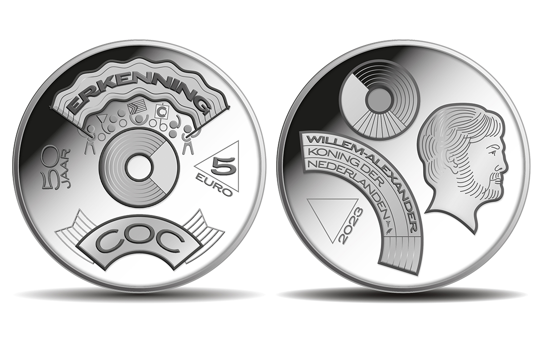
50 Jaar Erkenning COC
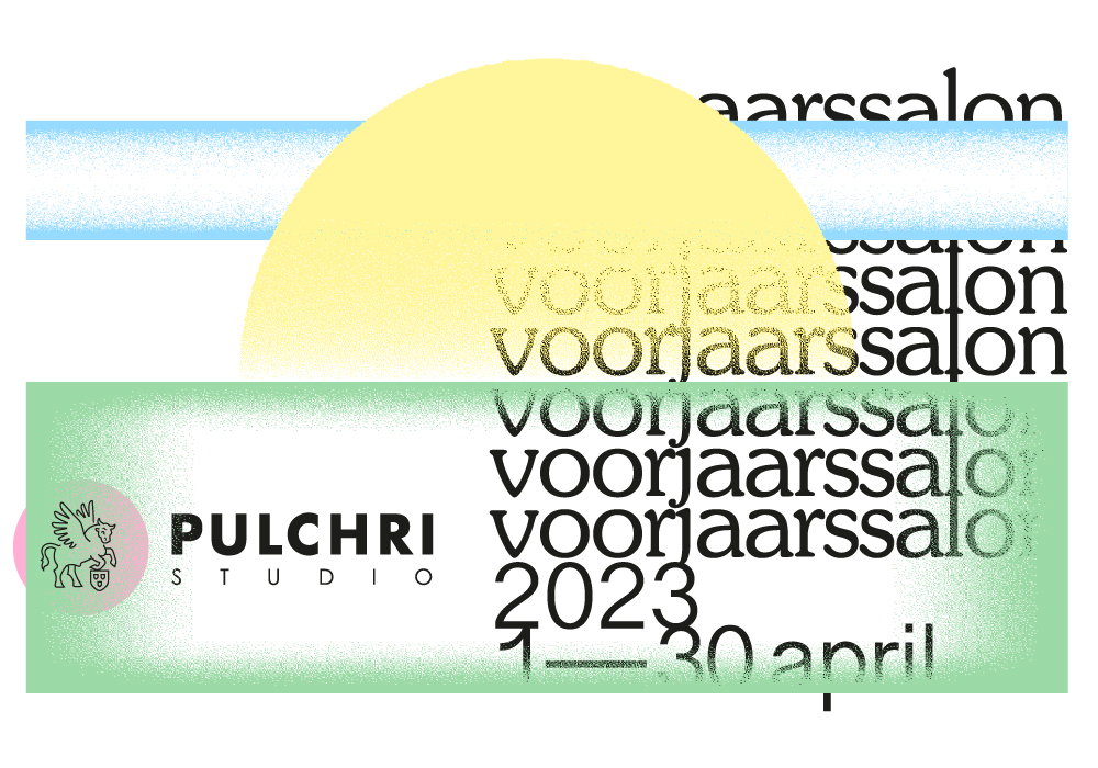
Pulchri Studio
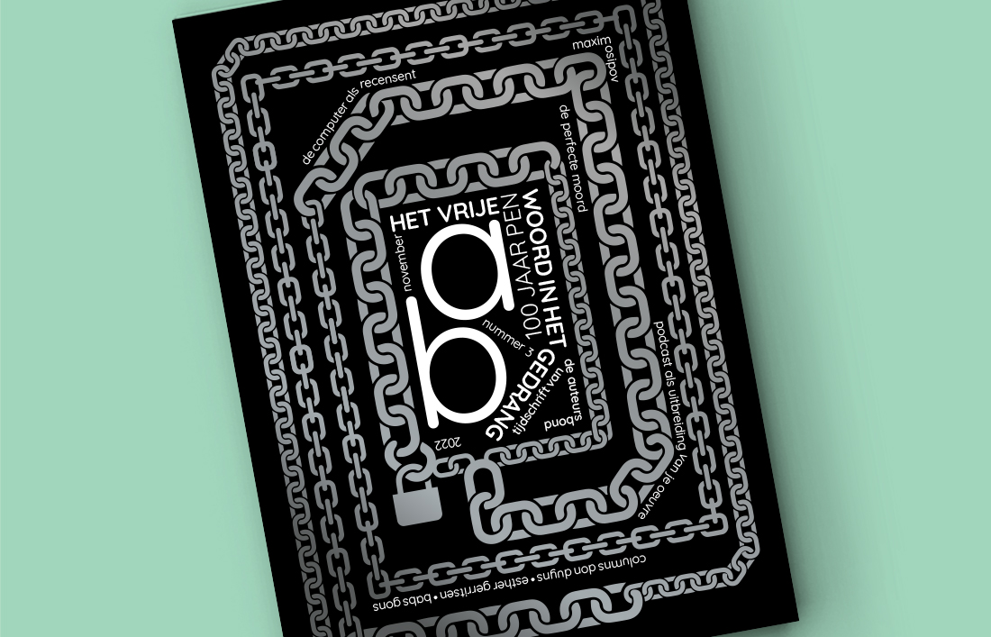
Het vrije woord in het gedrang
Portfolio
Autonoom
Beeldend
Featured
Promotioneel
Redactioneel
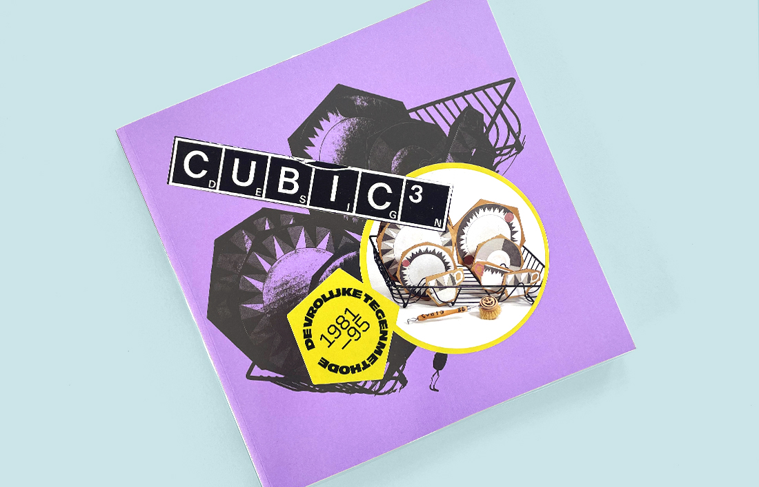
Cubic 3 Design (1981-1995)
Redactioneel
30 augustus 2022
9 juni 2023
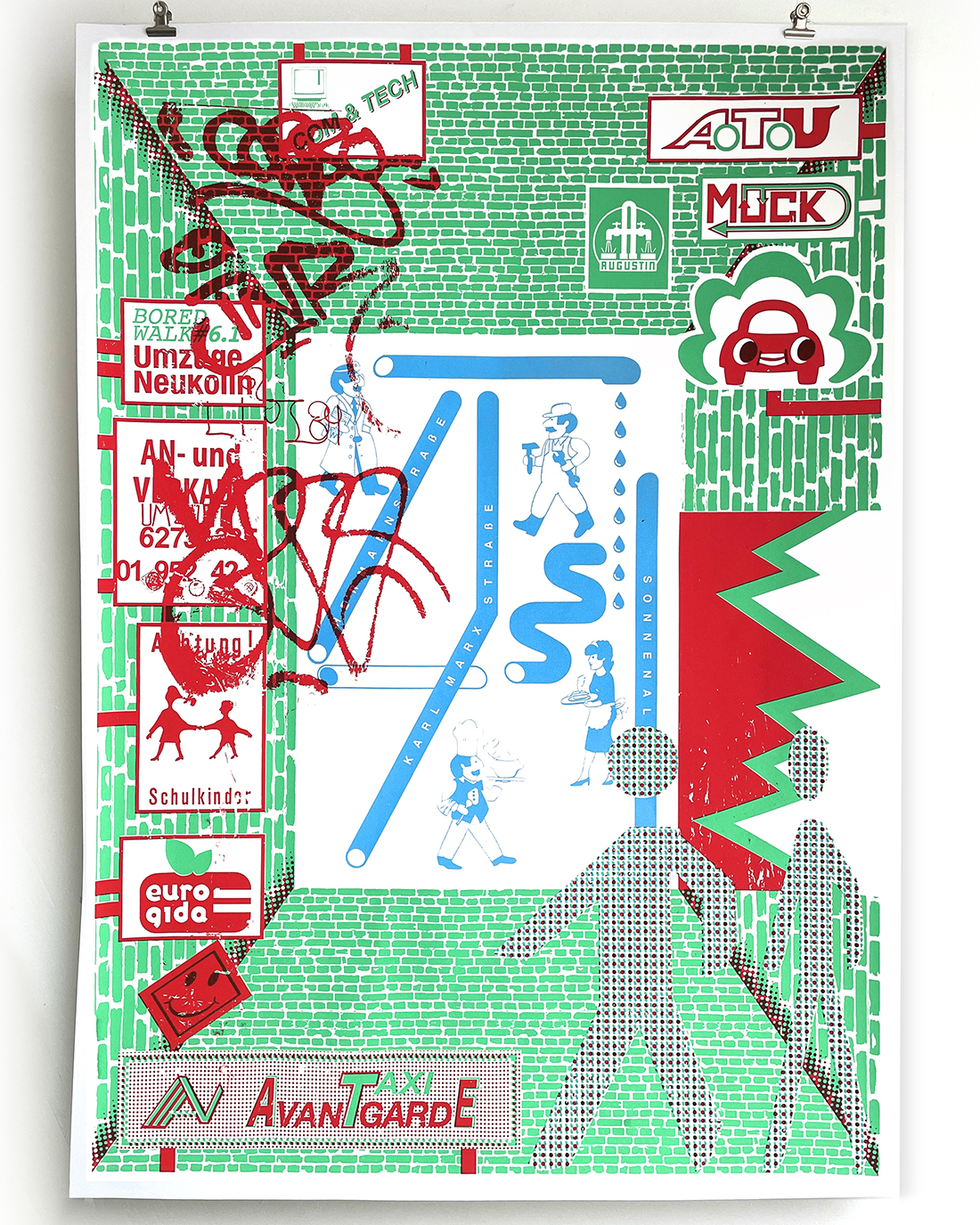
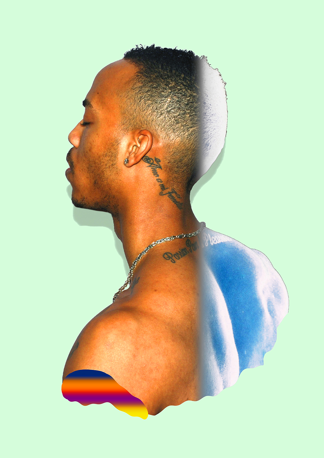
BoredWalks
Autonoom
Beeldend
13 juni 2022
15 juni 2023
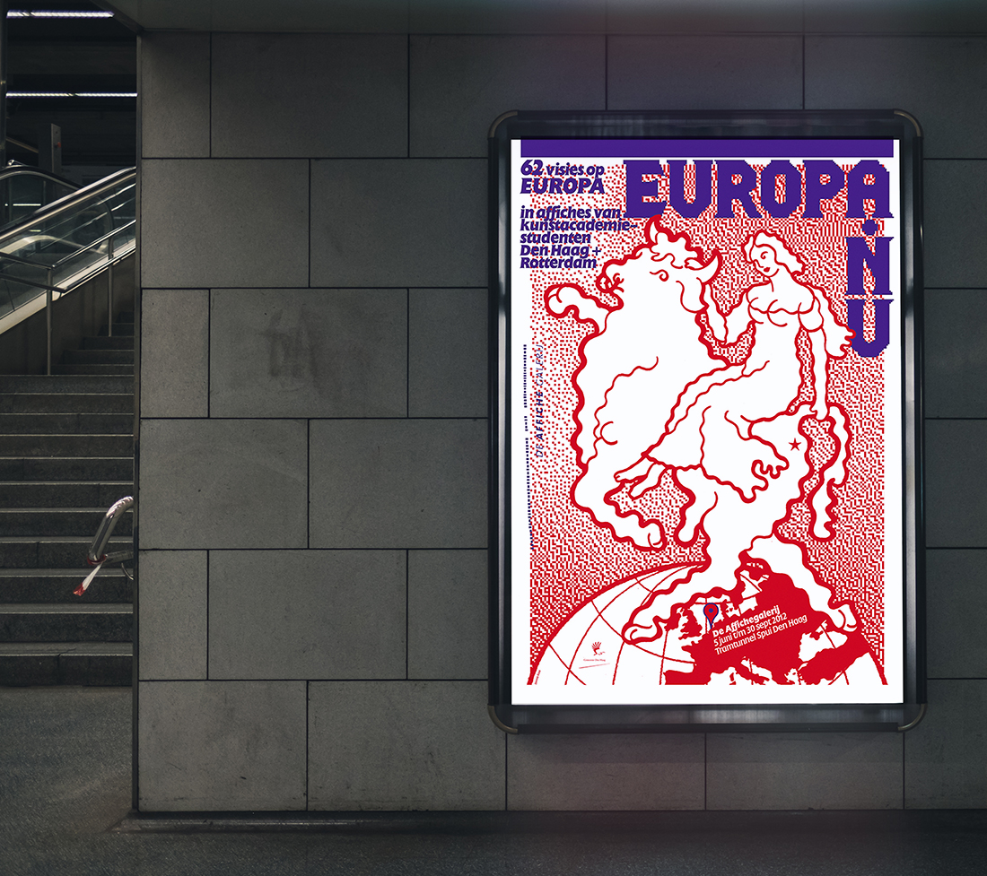
Affiche Galerij
Beeldend
Promotioneel
21 oktober 2020
1 december 2020
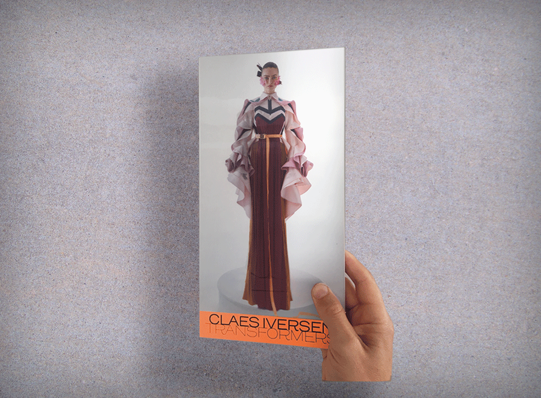
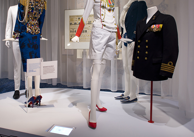
Claes Iversen – Transformers
Redactioneel
13 oktober 2020
30 augustus 2022
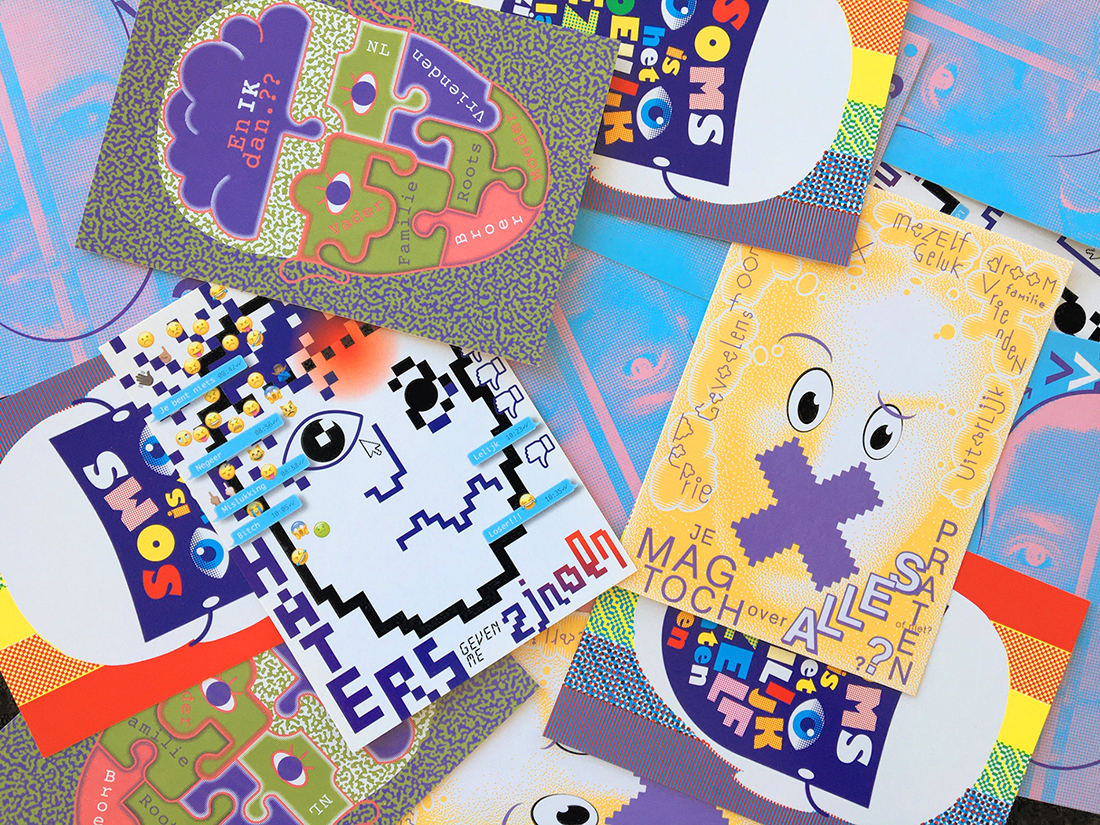
Anti-depri posters
Beeldend
Promotioneel
12 oktober 2020
2 december 2020
Fashion Ahoy!
Beeldend
Promotioneel
9 oktober 2020
25 maart 2021
Posters in de Boekhorststraat
Autonoom
Beeldend
3 oktober 2020
19 april 2021
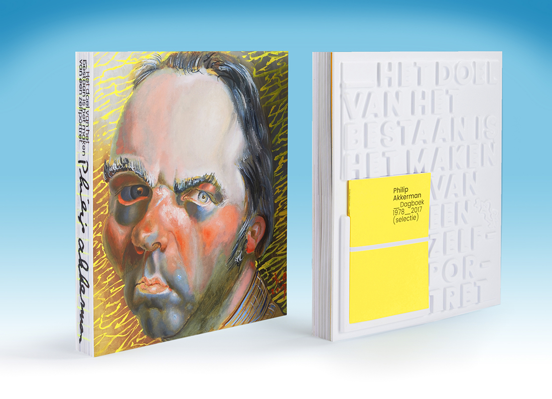
Het doel van het bestaan…
Redactioneel
2 oktober 2020
18 april 2021
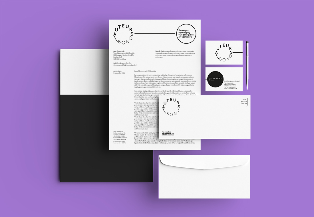
Auteursbond
Promotioneel
2 oktober 2020
27 oktober 2020
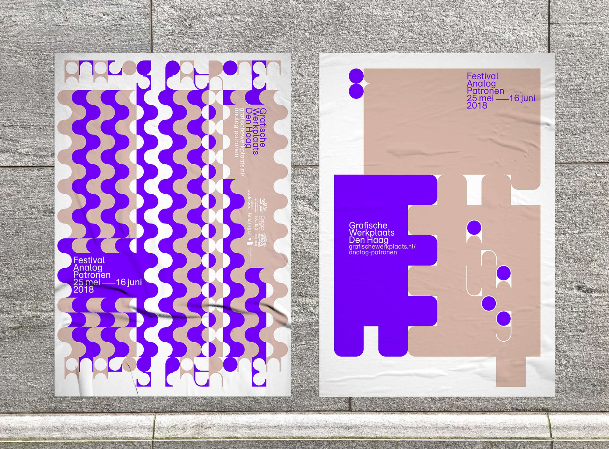
Analog Patronen
Promotioneel
28 september 2020
5 oktober 2023
Posts navigation
Load More